The following relationships will hold when generating performance measures.
![]()
A stacked bar chart may be used to display these relationships. Using the performance measure ppm as a base, stacked bar charts may be created by using sections which represent the incremental differences between the performance measures. The height of each section display the various performance measures. These bar charts show the observed performance and the improvement potential if the process is brought on target, the process stream variation is removed, and the process is brought into control. An example is shown in the following diagram.
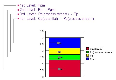
The sections of the bars in the chart show the potential performance improvement that would occur in the ppm value when various improvements are made.
- The lowest section of the bars show the observed performance measure, ppm.
- The top of the second section of the bars show the performance had the process average been on target.
- The top of the third section of the bars show the performance of the process had the means for each process stream been on target.
- The top of the highest bar sections show the potential of the process if through-time variation is removed (control achieved) and each process stream mean is on target.
While the areas of the top three bar sections can be thought of as observed losses, these areas cannot be compared. The improvement potential seen on the stacked bar chart occurs when the process is brought on target, then process stream differences are removed, and finally through-time stability is achieved. Note that changes in higher bars represent a smaller change in process variation than a change in a lower bar.
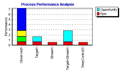
Another approach is to display improvement opportunities in separate bars. This may be done by showing the effects if the process was brought on target, or the process stream differences were removed, or the process is brought into control. This may be seen in the following example.
To assess relative importance of the various factors see Variance Components.
Note that ppm will be generally smaller than pp, although it is possible with one-sided specifications to see the reverse. This can occur depending on the location of the target, the mean, and the specification limit.